🧮 Earnings
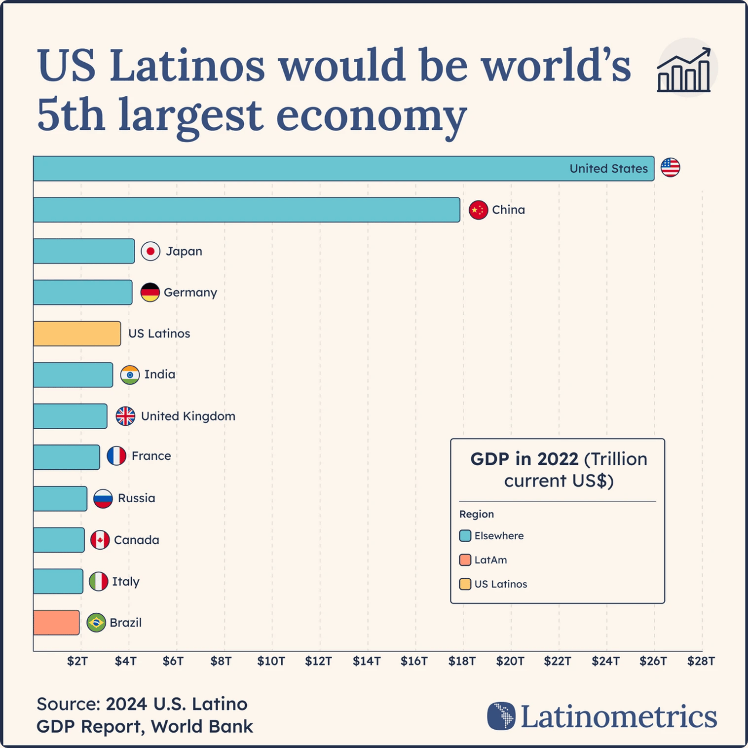
We get asked about one chart more than any other. It's the one that puts 65M US Latinos ahead of Brazil, India, and Russia.
Every once in a while, we here at Latinometrics will attend events in order to present on some of the biggest trends happening across Latin America, or to meet some of our region's leaders.
Without fail, one chart is consistently cited as the people's favorite, with some of you even mentioning how this specific chart has made its way through your corporate Slack channels and family WhatsApp groups.
The chart in question, which you can find below, looks at the total economic output of the US Latino community, which at roughly $4T would be the fourth-largest economy of the world—ahead of entire continent-sized countries like Brazil, India, or Russia.
Longtime Latinometrics readers know (and clearly love) this chart, and many Hispanic Americans have highlighted to us how this reframing of their important position in the US feels particularly timely today.
And there's lots to be impressed about, given just 65M Latinos outperform every economy worldwide aside from China, Germany, Japan, and (of course) the US.
In keeping with the spirit of dispelling some more narratives this week, let's zoom in to see the specific earnings of Hispanic Americans, which are employed in—and own companies in—far more sectors than you might think.
On average, South Americans tend to be more educated and higher-earning than their Central American peers, which likely explains the sectoral divisions seen between these two subregions in terms of employment. In two cases—Argentines and Chileans—they actually out-earn the average American.
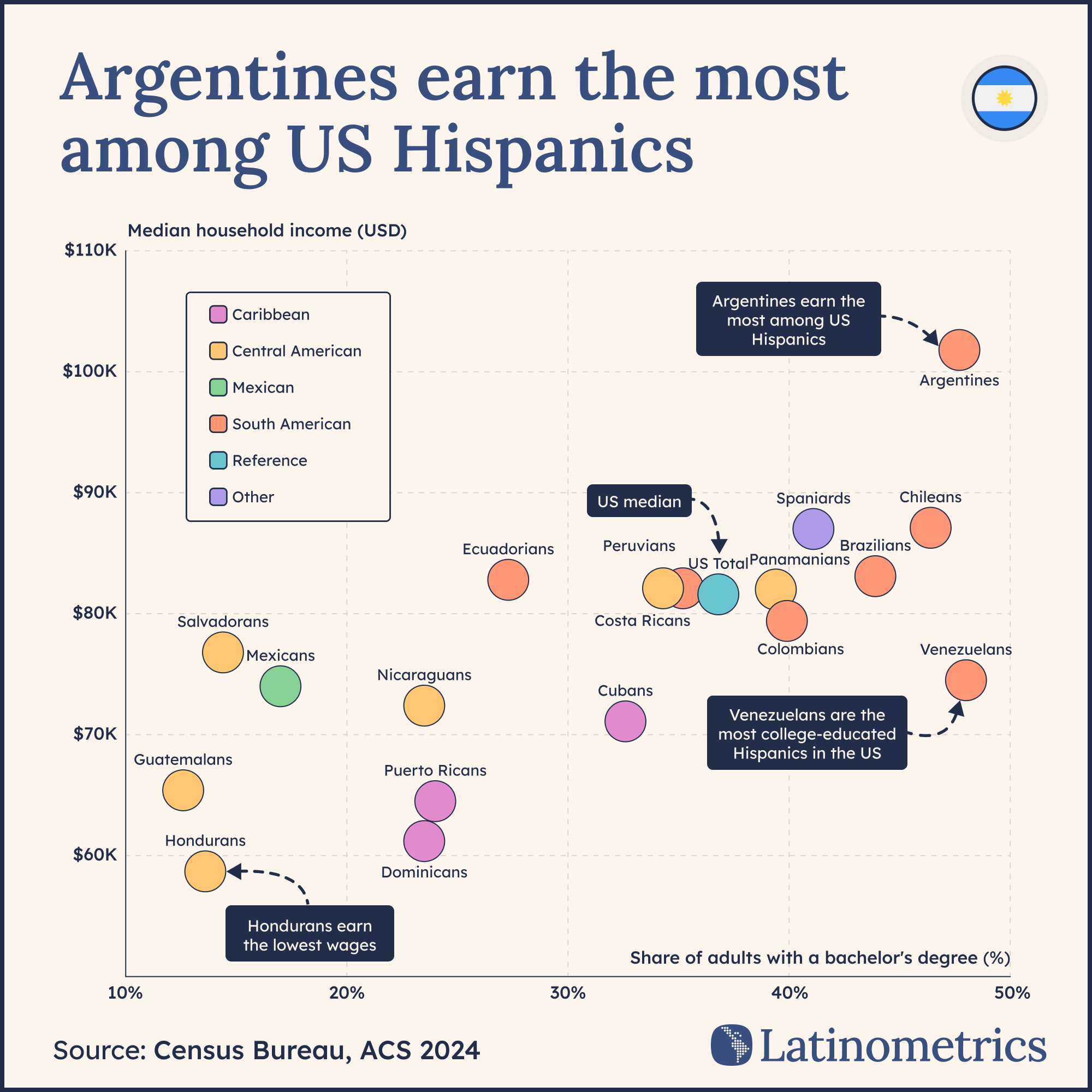
If you're scratching your head at the gaps in question among immigrant communities within the same demographic population, it may help to look at a tale of two countries.
In the case of Argentina, nearly half of adults have an undergraduate degree and the median household has a six-figure income (roughly 30% above the US national median). We're talking about a country geographically very far from the US—as far as you can get, really, within the Western Hemisphere.
This is a country of highly educated, often English-fluent working professionals (like engineers or scientists), many of whom left Argentina due to its repeated economic crises, in a multi-decade brain drain.
To contrast, Honduras is a far closer, far less developed country, one from which many people escaped not merely for higher salaries or better-functioning government but out of genuine desperation. Hondurans tended to gravitate towards lower-paying jobs, with impacts on everything from their socioeconomic mobility to even their home ownership rates.
The $4T Latino economy contains multitudes. The distance traveled, the education carried, the desperation escaped. We think it's worth knowing who's actually inside that number.
Comment of the week 🗣️
Gabriel adds color to the story of Argentina’s inflation cycles. He’s speaking of Cristina Fernández de Kirchner, who was president for a total of 8 years (succeeding her husband). Should we have included her first term, would the story be different?
Not dramatically. Private estimates put CFK's first term (2007–2011) at roughly 120% accumulated inflation — nearly identical to her second term. The visual would be one more gentle slope before the Alberto Fernández explosion.
The reason we didn't include it is messier. INDEC, Argentina's statistics agency, was intervened in 2007 and its inflation data was widely considered fabricated. The official number they gave was 40%. The IMF formally censured Argentina in 2013 over the discrepancy, the first censure of any member state.
Gabriel's broader point stands, though: Kirchnerismo governed Argentina for 12 of the 20 years on that timeline.

Feedback or chart suggestions? Reply to this email, and let us know!