
Data Storytelling: The Complete Guide to Finding and Telling Stories with Data
How to find stories in data, design visualizations that communicate clearly, and write narratives that make your work shareable. Based on 600+ charts we've created at Latinometrics.

What Is Data Storytelling?
"Extreme poverty in Latin America has decreased a lot."
Share that in any group chat and wait for the pushback.
- How much is "a lot"?
- Compared to when?
- Says who?
Now consider sharing this instead:
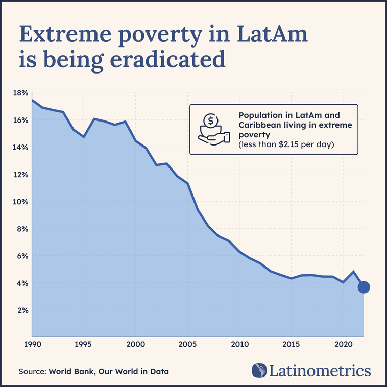
Same idea. Completely different impact.
That's data storytelling—finding insights in data and communicating them through visuals and narrative so they actually land. It's how you turn spreadsheets into arguments that persuade investors, inform decisions, and build authority.
This guide covers the complete process: developing the curiosity to find stories, choosing the right visualizations, designing for clarity, and writing narratives that make your work shareable. It's based on hundreds of visualizations we've created at Latinometrics—work that consistently outperforms major media outlets in engagement.
Whether you're a marketer, analyst, or founder, the principles are the same. Let's start with the most overlooked skill: how you think.
The Data Storytelling Mindset
Before you touch a spreadsheet or choose a chart type, you need to develop something most people overlook: curiosity.
You've probably never taken a class on curiosity. Schools teach math, writing, even "critical thinking," but not the subtle skill of looking at the world and wondering what the how things might work.
What does this have to do with data? Everything. Data is our only tool to understand the world at a macro level. Everything else we experience is anecdotal.
This is exactly what separates people who make forgettable content from those who find stories worth telling. They are willing to ask “why?”
Here's why it matters: every visualization, every analysis, requires a process of constant exploration. You can't find an interesting insight if you're not genuinely curious about what the data might show. The technical skills: the formulas, the design, the tools, those are learnable in a weekend. Curiosity is the muscle that takes longer to build, but it's what makes everything else worthwhile.
Start Seeing the World Through Data
Behind every headline you read, there's a dataset. Train yourself to notice it.
When you see a news story about foreign investment flooding into Mexico, ask: Where is that data? Who tracks it? How has it changed over time? Which sectors? Which countries are investing?
When Argentina elects a new president, the story isn't just political drama—it's voting patterns, demographic shifts, regional differences, turnout rates. All of that is data waiting to be visualized.
When you read about water scarcity in Colombia, there's a deeper question: How does Colombia's water consumption compare to other countries? Is the problem getting worse? Which regions are most affected?
It’ a mental habit. Automatically asking "what's the data behind this?" is the foundation of data storytelling. Once you start thinking this way, you'll never stop. You'll see potential visualizations everywhere: in earnings reports, in sports statistics, in your city's budget, in your company's sales figures.
Sources of Inspiration
To accelerate your curiosity, immerse yourself in good examples. These are accounts and communities we follow and admire:
r/dataisbeautiful — Reddit's data visualization community. Ranges from simple bar charts to complex interactive pieces. Great for seeing what resonates with audiences. You also get a good amount of feedback that people in the community give to creators, so it’s a good learning experience. Latinometrics has gotten some excellent feedback from that forum over the years. They can be ruthless but learning is always somewhat uncomfortable.
Our World in Data — Perhaps the best example of data storytelling for public understanding. Their data explorers and long-from pieces on global issues combine rigorous data with clear narrative.
The Pudding — Visual essays that push the boundaries of what data storytelling can be. More experimental, but incredibly inspiring.
Latinometrics — Our own work, focused on Latin America. We've found that some of our simplest charts outperform our most complex ones—a lesson in itself.
The Shift That Changes Everything
Once you internalize this mindset, something clicks. You stop seeing data as numbers in a spreadsheet and start seeing it as stories waiting to be told. The news becomes a source of ideas. Conversations spark questions you want to answer with charts. It actually enables you to think more critically about issues. What is the data that will put this debate to rest?
Finding the Story
Here's the most counterintuitive advice in data storytelling: don't start with a story in mind.
Most people approach data backwards. They decide what they want to prove, then hunt for numbers that support it. This is how you end up with misleading charts, cherry-picked statistics, and analysis that falls apart under scrutiny.
The better approach? Let the story find you.
The Forest Analogy
Think of a dataset as a forest. Your role isn't to be a lumberjack that cuts it down and hauls away what you want. And you're not a gardener planting roses and reshaping it to your vision.
Your role is to be an explorer. Respect the forest. Examine it. Understand what it's actually made of. Then communicate what you found.
In practical terms: arrive at your data with curiosity and an open mind. Don't assume you know what story is hiding there. You might be wrong, and even if you're right, you'll miss better stories along the way.
The Method: Ask Questions
So how do you explore a dataset without a predetermined story? You ask it questions.
Start simple. Then get progressively more creative.
Level 1 — Descriptive: "Which countries have the highest GDP?"
This gives you orientation. You understand the landscape.
Level 2 — Filtered: "Which countries have the highest GDP in Latin America?"
Now you're narrowing focus, finding relevance.
Level 3 — Comparative: "How does Brazil's GDP compare to Mexico's over the past 20 years?"
You're looking for relationships and context.
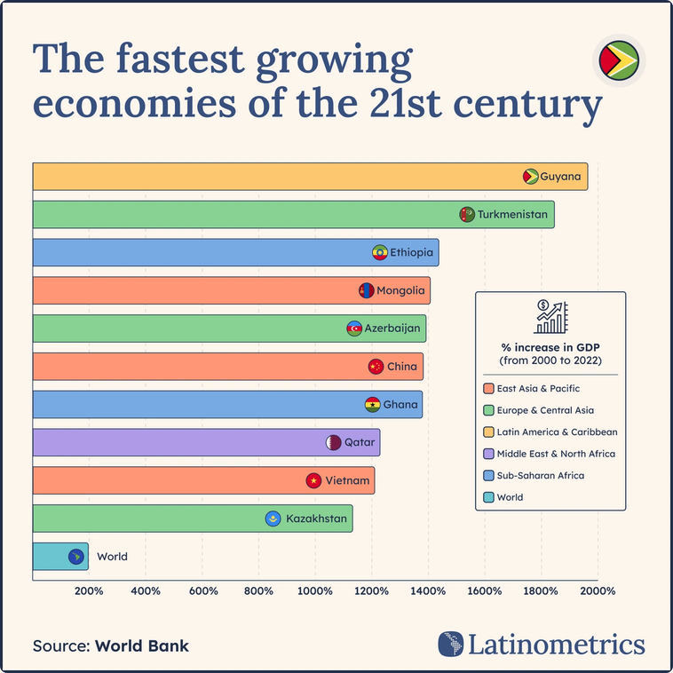
Level 4 — Creative: "Which country has grown its GDP the most since 2000?"
This is where stories emerge. The answer might surprise you.
When we asked that last question of World Bank data, we discovered Guyana (a small South American country most people couldn't locate on a map) is home to the fastest-growing economy of the 21st century. That's a story. And we didn't start with it. The data revealed it.
Why This Works
The question-based approach works because it keeps you honest. You're not forcing the data to say something. You're genuinely exploring what it contains.
It also surfaces unexpected insights. If you only look for what you expect to find, you'll never discover the Guyanas hiding in your data—the surprising stories that actually capture attention.
Every chart we've made that performed well started this way. Not with a conclusion, but with a question. The more creative the question, the more interesting the answer tends to be.
Before you open any design tool, before you think about colors or chart types, sit with your data and interrogate it. Ask the obvious questions first. Then ask the weird ones.
The story will find you.
Where to Find Reliable Data
The best story means nothing if your data is wrong. Before you visualize anything, you need sources you can trust.
The good news: high-quality data is more accessible than ever. The challenge is knowing where to look and how to evaluate what you find.
Recommended Sources
These are sources we rely on at Latinometrics. They're credible, well-documented, and free:
Our World in Data — Covers global topics from poverty to energy to health. Excellent for long-term trends and cross-country comparisons. Data is clean and downloadable.
World Bank — The standard for economic and development indicators. GDP, population, trade, education. If it measures a country's progress, it's probably here.
IMF — Macroeconomic data, fiscal indicators, and economic forecasts. Particularly strong on financial and monetary metrics.
Central Banks — For country-specific economic data (exchange rates, inflation, interest rates). Banxico for Mexico, BCB for Brazil, and so on.
Government Statistics Agencies — INEGI (Mexico), IBGE (Brazil), DANE (Colombia), INDEC (Argentina). These are primary sources for census data, labor statistics, and domestic economic indicators.
Company Earnings Reports — Underused but valuable. Public companies disclose revenue, users, growth rates, and market data. First-party data you won't find elsewhere. Many tools also report the standardized data of publicly-traded companies. Examples:
The Credibility Checklist
Not everything on the internet is trustworthy. Before using any source, run through these questions:
Is it cited by publications you trust?
If major newspapers and academic papers reference this source, that's a good sign.
Does it come from a government or academic institution?
These organizations have reputations to protect and methodologies to defend.
Is it current?
Data from 2015 might be irrelevant for a 2025 story. Check when it was last updated.
Is there transparency about who collects the data?
Anonymous sources are red flags.
Is the methodology documented?
Good sources explain how they measure things. If there's no methodology section, be skeptical.
Are there known critiques?
A quick search for "[source name] criticism" or "[source name] methodology problems" can reveal issues. Every source has limitations—knowing them helps you use data responsibly.
When in doubt, cross-reference. If two reputable sources show similar numbers, you're probably safe. If they diverge significantly, investigate why before publishing.
Start Simple
For beginners, start with Our World in Data or the World Bank. Both offer clean, downloadable datasets and clear documentation. You can build dozens of strong visualizations without ever leaving these two sources.
Once you're comfortable, branch out to primary sources for more specialized or timely data that is relevant to you.
Anatomy of a Chart
Chart complexity can range from a simple bar graph to an intricate multi-layered visualization. The good news: simpler usually wins.
Since starting Latinometrics, we've noticed something consistent—our top-performing charts are almost always the simple ones. In fact, a basic bar chart we made became the second most popular post on r/dataisbeautiful in all of 2022. A community full of data geeks, and what resonated most was a simple insight.
The Only Two Requirements
At its core, every chart needs just two things:
- It measures something
- It compares something
That's it. Everything else is supporting structure. When you frame it this way, building a visualization becomes far less intimidating.
The Essential Elements
Here's what a complete chart looks like, broken into its components:
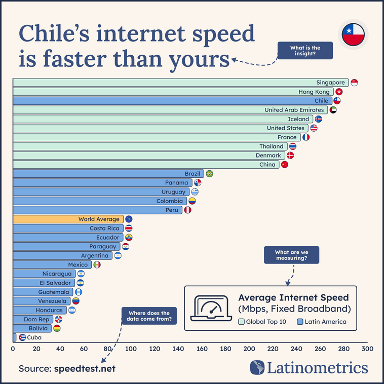
What are we looking at? Should be clear enough that someone glancing at your chart understands it immediately.
Where did this data come from? Non-negotiable for credibility.
Optional Elements
These can help but aren't always necessary:
Grid lines — Help readers trace values accurately. Use sparingly—too many create visual noise.
Axis titles — Label what each axis measures. Essential when units aren't obvious.
Footnotes — Clarify methodology, exclusions, or definitions. Keep them brief.
Choosing the Right Chart
The chart type you choose shapes how people understand your data. Choose wrong, and you'll confuse your audience—or worse, mislead them. Choose right, and the insight becomes obvious at a glance.
The decision is simpler than most people think. It comes down to one question: What are you trying to show?
One-Dimensional Charts: One Variable
Use these when you want maximum clarity and a single, direct message.
Bar Chart — The workhorse. Best for comparing categories.
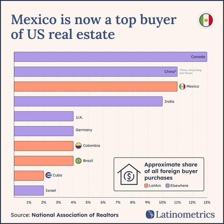
When to use:
- Comparing items (countries, companies, categories)
- Ranking things
- Showing differences in magnitude
Horizontal or vertical? Horizontal works better when you have long labels or many categories. Vertical works better for time-based categories (months, years).
Pie Chart or Treemaps — Shows parts of a whole.
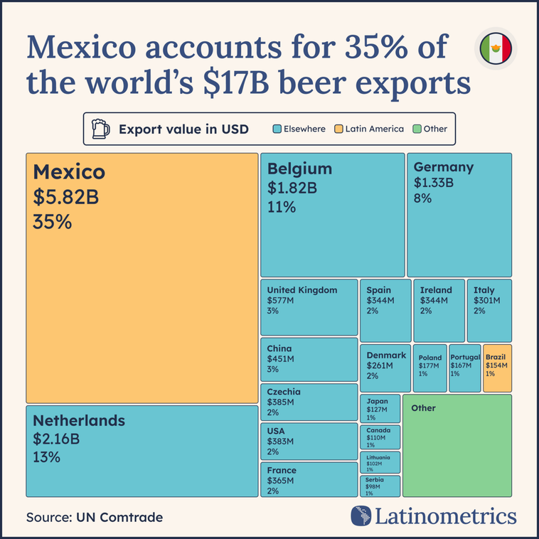
When to use:
- Showing composition (what makes up a total)
- When you have 2-4 segments maximum
- When one segment dominates (that's the story)
When to avoid:
- More than 5 segments (becomes unreadable)
- Comparing precise values (bars are better)
- When segments are similar sizes (differences are hard to see)
Data visualization purists criticize pie charts, often fairly. But when one segment dominates—like the US receiving 78% of Mexico's exports—a pie chart communicates that instantly.
Multi-Dimensional Charts: Two or More Variables
Use these when you need to show relationships, changes over time, or more complex stories.
Line Chart — Shows change over time. The default for trends.
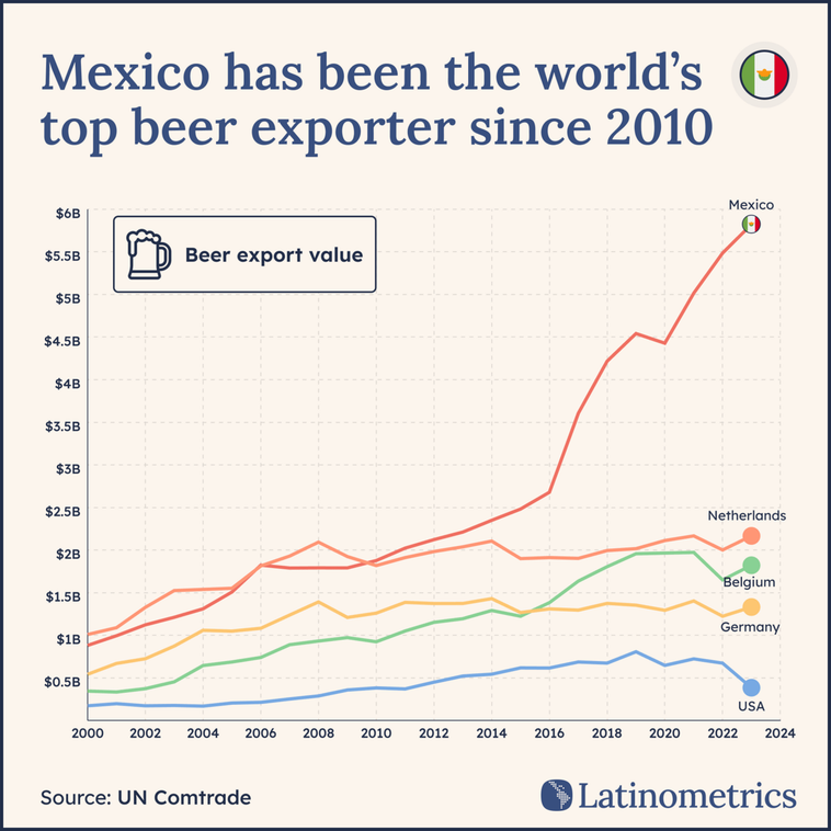
When to use:
- Tracking something over time
- Showing trends, growth, or decline
- Comparing trajectories of multiple items
Scatter Plot — Shows relationship between two variables.
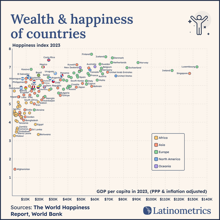
When to use:
- Exploring correlation between two metrics
- Finding outliers
- When both axes represent meaningful variables
Color as a Dimension — Any chart becomes multi-dimensional with strategic color.
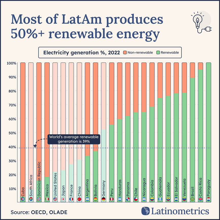
This is a stacked bar chart. By using color to distinguish between “Renewable” and “Non-renewable” energy within the same bar, it adds a second dimension of data (composition) to the standard country ranking
The Decision Framework
Comparison between categories → Bar chart
Parts of a whole → Pie chart (if ≤4 segments) or Treemap
Change over time → Line chart
Relationship between two variables → Scatter plot
Geographic patterns → Map
Add a dimension to any chart → Color
When in Doubt
Start with a bar chart. It's almost never wrong. You can always add complexity later
However, you can't rescue a confusing chart by making it simpler.
If a bar chart doesn't work, ask yourself what's missing. Do you need time? Use lines. Do you need correlation? Use a scatter plot. Do you need composition? Consider a pie.
The goal isn't to impress people with chart variety. It's to make your insight undeniable.
Design Principles That Make Charts Better
It's easy to make a chart. It's harder to make one people actually want to look at.
The difference isn't artistic talent—it's understanding a few core principles. Apply these consistently and your visualizations will improve immediately.
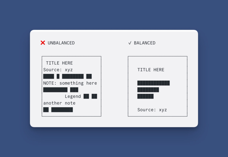
Balance
Most beginners cram too much into the frame. Every element competes for attention, and nothing wins.
Good balance comes from:
Alignment — Guide the eye. Elements that relate should line up.
Hierarchy — Show what matters most. Your title and main data should dominate. Sources and footnotes should recede.
Contrast — Create difference where difference matters. If everything is bold, nothing is.
Symmetry — Reduce the feeling of chaos. This doesn't mean everything must be centered—it means visual weight should feel distributed.
White Space
The most underused element in amateur charts.
White space isn't wasted space. It's what lets your data breathe. It directs attention to what matters by removing what doesn't.
If your chart feels cluttered, the answer usually isn't better organization—it's deletion. Remove grid lines. Remove redundant labels. Remove that second footnote. Keep only what's essential.
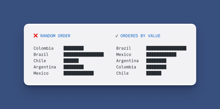
Logical Order
Our brains constantly seek patterns. Help them.
Always order your data intentionally:
- By value — Largest to smallest (or vice versa)
- By time — Chronological for temporal data
- By geography — North to south, or grouped by region
- Alphabetically — Only when no other order makes sense
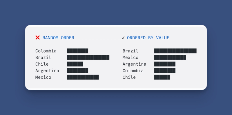
Never present data in random order. It forces readers to work harder than necessary.
Color
Color is powerful—which is why it's easy to misuse.
Limit your palette. Two or three colors maximum for most charts. More than that creates noise.
Use contrast intentionally. Color should highlight what matters. If you're showing Latin American countries versus others, make Latin America one color and everything else gray.
Design for accessibility. Around 8% of men have some form of color blindness. Don't rely on color alone to convey meaning—pair it with patterns, labels, or position.
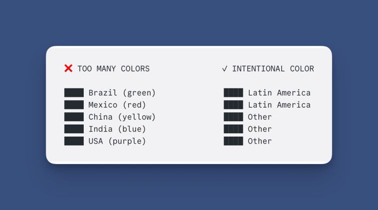
Color should be your last tool for differentiation, not your first. If you can distinguish elements through position or labels, do that instead.
Text
How much text should accompany your chart? Enough to guide the reader, not so much that it overwhelms the visual.
Use two fonts maximum. One for titles, one for everything else.
Ensure readability. If someone has to squint, your text is too small.
Don't state the obvious. If the chart clearly shows Brazil is largest, you don't need a label saying "Brazil is the largest."
The Simplest Test
Step back from your chart. Squint at it. What do you notice first?
If the answer is your main insight, you've designed well. If the answer is clutter, grid lines, or a rainbow of colors, simplify.
Good design is invisible. It doesn't call attention to itself—it calls attention to the data.
Tools for Data Storytelling
You don't need expensive software to create professional visualizations. The tools we use at Latinometrics are either free or have free tiers that cover most needs.
What matters more than the tool is the workflow: get your data clean, explore it, visualize it, then refine the design.
For Data: Google Sheets
This is where everything starts. We use Google Sheets over Excel for a few reasons:
- Free — No license required
- Collaborative — Multiple people can work simultaneously
- Real-time — Changes sync instantly
- Accessible — Works in any browser, no installation
If you're still using Excel, especially when working with a team, consider switching. The collaboration features alone are worth it.
Google Sheets handles data cleaning, basic formulas, and even simple charts. For many projects, you won't need anything else.
For Quick Visualizations: Native Chart Tools
When speed matters more than polish:
Google Sheets Charts — Built in, surprisingly capable. Good enough for internal presentations or quick exploration.
Datawrapper — Free tier available. Clean defaults, responsive charts, easy embedding. Great for publishing to web.
Flourish — Free tier available. Stronger on animated and interactive visualizations. Templates make it beginner-friendly.
These tools get you from data to chart in minutes. The tradeoff: limited customization.
For High-Production Work: Design Software
When you need pixel-perfect control—for reports, presentations, or social content—export your chart and refine it in design software.
The workflow:
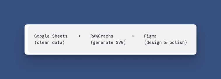
RAWGraphs — Free, open-source. Paste your data, choose a chart type, export as SVG. The SVG format preserves every element as editable vectors.
Figma — Free tier available. Industry-standard design tool. Import your SVG and adjust colors, typography, spacing, and layout with complete control.
Adobe Illustrator — Paid. The traditional alternative to Figma. Same vector editing capabilities, steeper learning curve.
This is the Latinometrics workflow. Google Sheets for data, RAWGraphs for the initial chart, Figma for final design. Every chart you've seen from us went through this process.
The Right Tool for the Job
Exploring data → Google Sheets
Quick chart for a meeting → Google Sheets
Publishing to web → Google Sheets, Datawrapper or Flourish
Social media content → Google Sheets or Figma (via RAWGraphs)
Print or presentation → Google Sheets or Figma or Illustrator
You’ll notice Google Sheets does everything. The others are if you really want to elevate or customize. Don't overcomplicate it. Start with Google Sheets. Add design tools when your work demands higher polish.
The tool doesn't make the story. The story makes the story. Tools just help you tell it clearly.
Writing the Narrative
The chart is done. Now comes the part most people get wrong: the words around it.
There's a temptation to describe what the visualization already shows. Don't do it. If your chart displays GDP growth from 2000 to 2022, writing "GDP grew from $712 million in 2000 to $14.7 billion in 2022" adds nothing. The reader can see that. Your words should do what the chart cannot.
Here's the test: if you deleted the text, would the chart lose meaning? If yes, you're doing it right. If the chart stands alone just fine without your words, you've written filler.
What Good Narrative Copy Actually Does
Consider Guyana—one of the most dramatic economic stories of the 21st century. A simple line chart shows GDP exploding after 2020. Now compare two approaches to the accompanying text:
Approach A: "In 2000, Guyana's economy was worth $712 million. It stayed flat until 2006, when GDP climbed to $2.3 billion. Then in 2021, significant growth occurred, followed by even more in 2022, reaching $14.7 billion."
Approach B: "Guyana has had the fastest economic growth in the world this century. The small South American country—English-speaking, population under one million—saw this explosive development very recently. What caused it? A massive offshore oil discovery. To illustrate how drastic the shift was: in 2019, Guyana exported zero petroleum products. By 2022, oil represented 86% of all exports. This year, Exxon announced it's producing 645,000 barrels per day from those fields."
Same chart. Completely different value.
The Five Elements of Strong Narrative Copy
When you write text to accompany a visualization, aim to include:
- A surprising insight the chart doesn't show — "Fastest economic growth in the world this century" isn't visible in the line. That context transforms the data.
- Background that humanizes the subject — Population size, language, geographic context. Readers anchor better when they can picture the place.
- The cause behind the pattern — This is the most important element. Data shows what; narrative explains why. The oil discovery is the story. Without it, the chart is just a line going up.
- An illustration that makes the transformation concrete — "Zero petroleum exports to 86%" lands harder than "exports grew significantly."
- A current development that makes it timely — Exxon's production numbers connect the historical trend to right now. It gives readers a reason to care today.
This approach requires more research. You need to dig past the data into the forces that shaped it. But that's exactly what separates forgettable charts from analysis people actually remember and share.
How to Write Hooks
You've found a story, built a chart, written context that adds value. None of it matters if no one stops scrolling long enough to see it.
On social platforms, the first sentence does nearly all the work. This is your hook—the line that determines whether someone keeps reading or moves on.
What Makes a Hook Work
Go back to the Guyana example. Which sentences have the most stopping power?
- Sentence 1: "Guyana has had the fastest economic growth in the world this century."
- Sentence 3: "What caused it? A massive offshore oil discovery."
Sentence 1 delivers a surprising insight—a claim that makes people pause and want verification. Sentence 3 explains the why, which triggers curiosity. Both work because they contain information density without requiring context.
The hook formula: Combine a surprising insight with the "why" behind the story.
Here's what that looks like:
🛢️🇬🇾 Oil off Guyana's coast, in just two years, has catapulted the country into the most explosive economy of the 21st century.
This single sentence packs the cause (oil), the timeline (two years), and the claim (most explosive economy). A reader doesn't need to see the chart yet to be interested.
Practical Hook Construction
You can develop hooks through iteration. Write your full narrative first, then ask: which single sentence would make someone stop scrolling? Often it's buried in paragraph two or three—pull it to the front.
Some approaches that consistently work:
- Superlatives with specificity: "The fastest-growing," "the largest," "the only country to..."
- Unexpected comparisons: "X is now bigger than Y" (where the comparison surprises)
- Time compression: "In just two years..." or "Since 2020..."
- Question + immediate answer: "What turned this country's economy around overnight? Oil."
The goal isn't pure clickbait. We’re looking for factually accurate clickbait. That means taking your most interesting finding and expressing it in the minimum and most engaging words needed to convey why someone should care.
Data Storytelling in Practice
The principles we've covered: curiosity, letting the story emerge, writing narrative that adds value, crafting hooks are not just theoretical. Here's how they play out in real campaigns.
Mercado Pago: When the Hook Does the Heavy Lifting
The challenge: Tell the story of Mercado Pago's evolution from payment processor to dominant fintech across Latin America, without it feeling like corporate PR.
The approach: We created five co-branded visualizations covering fintech market evolution, transaction volume growth, banking market share, regional dominance, and market cap comparisons. Each chart had a hook designed to stop scrolling. We also added insights that are invaluable to a Latin American audience.
The result: 972,000+ organic impressions across platforms. The content worked for social distribution and was reused in executive presentations internally—proof that good data storytelling serves multiple purposes from a single asset.
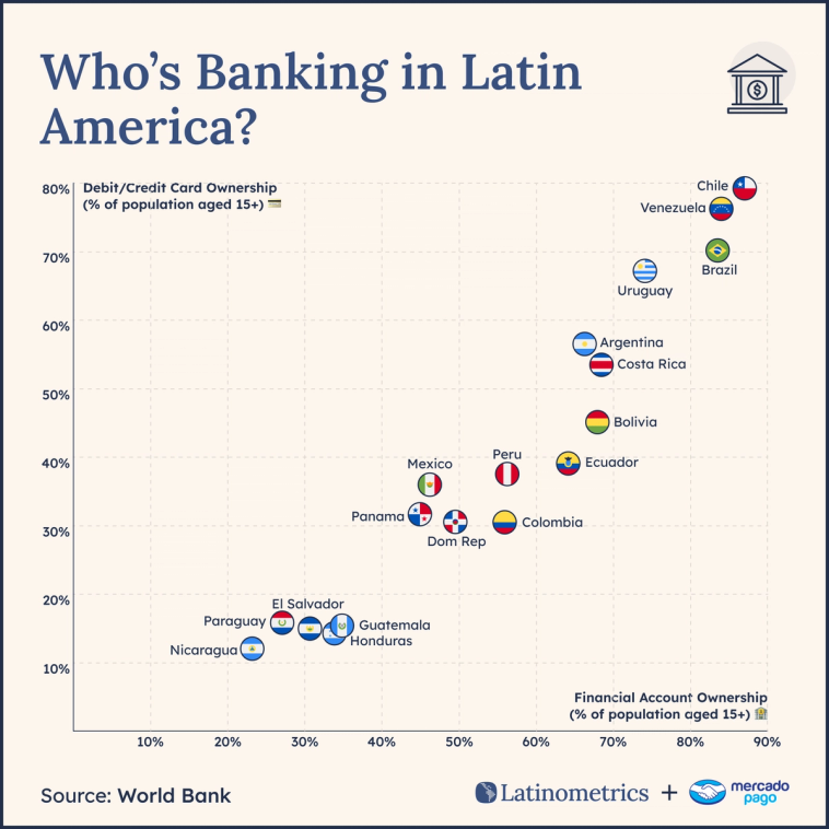
Principle applied: Section 10's hook formula. Surprising comparisons (fintech vs. traditional bank valuations) created the stopping power. The charts were simple; the framing made them shareable.
J.P. Morgan Private Bank: Narrative That Serves a Sophisticated Audience
The challenge: Create engaging content for high-net-worth, high-demanding, clients on complex market trends.
The approach: Custom charts covering S&P 500 analysis, sector performance, Latin American currencies, FDI flows, and real estate markets. Every visualization was designed with J.P. Morgan branding and produced in English, Spanish, and Portuguese. The narrative copy focused on the "why" behind each trend—not just showing that Brazilian real depreciated, but explaining the monetary policy decisions and commodity price shifts driving it.
The result: Enhanced brand positioning as thought leaders in Latin American markets. Content was distributed through private banking channels and reused in client advisory meetings.
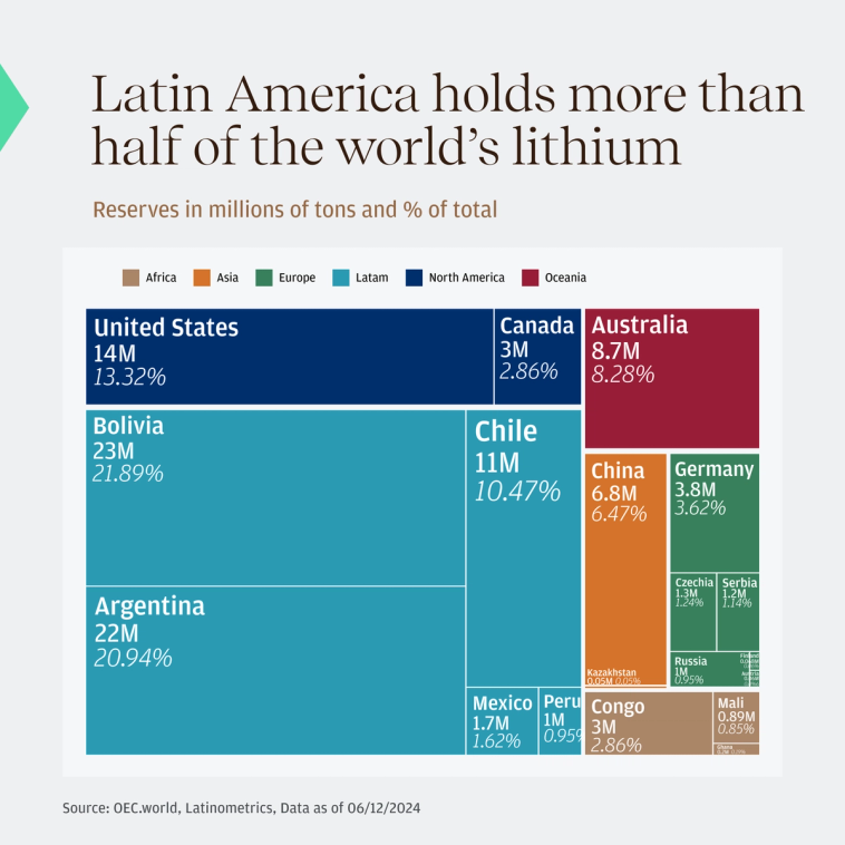
Principle applied: Section 9's rule—words should do what the chart cannot. For a sophisticated audience, that meant explaining causation and connecting data points to decisions they were actually facing.
Netflix + IDB: Turning Dense Research into Shareable Content
The challenge: The Inter-American Development Bank had comprehensive research on the economic impact of film production in Mexico and Brazil. The reports were valuable but inaccessible—too long, too academic, not formatted for social distribution.
The approach: We adapted the research into shareable visual content: ROI analysis of film incentives, regional employment impact, production spending flows. The forest analogy from Section 3 applied directly—we weren't rewriting the research to say what we wanted; we were finding the most compelling stories already buried in their data.
The result: Dense reports transformed into content that reached media executives, policymakers, and industry stakeholders across channels.
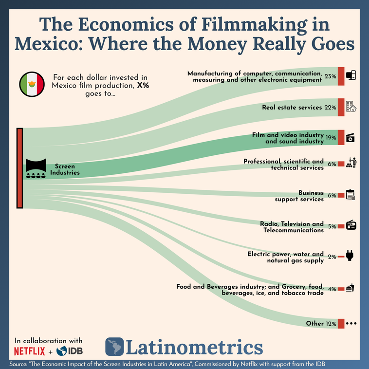
Principle applied: Section 3's core insight—let the story find you. The IDB data already contained narratives about job creation and economic multipliers. Our job was excavation, not invention.
Kilimo: Highly Technical Data as a Positioning Tool
The challenge: Kilimo, an agricultural water management company, had valuable insights on irrigation efficiency across Latin America and in California. They needed to translate what most may consider boring into thought leadership that would resonate with policy audiences and potential customers.
The approach: Co-branded content that positioned their internal metrics as industry benchmarks—not sales material, but genuine insight about water scarcity and agricultural adaptation.
The result: 16% click-through rate among California water policy audiences light years above typical content performance.
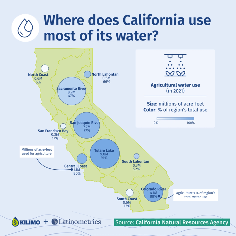
Principle applied: Section 4's emphasis on credible, unique data sources. Kilimo's highly specialized information was the asset; data storytelling was the distribution mechanism.
What Comes Next
You now have the complete framework: how to develop curiosity, find stories in data, choose the right visualization, write narrative that adds value, and craft hooks that capture attention.
The question is execution.
When to Build In-House
Data storytelling works as an internal capability if you have:
- Time: Each quality piece takes 10-20 hours—research, data cleaning, visualization, writing, design, distribution
- Skills across the stack: Analysis, design, copywriting, and social distribution are different disciplines; most teams are strong in one or two
- Consistent output: One viral chart builds awareness; sustained presence builds authority. That means producing regularly, not occasionally.
If you have all three, the principles in this guide will serve you well. Start with one piece, apply the frameworks, measure what works, and iterate.
When to Partner
Most marketing teams have data but lack bandwidth. Or they have bandwidth but lack design. Or they can produce content but don't have distribution that reaches decision-makers.
Latinometrics exists for that gap. We've produced 300+ data visualizations for companies like Netflix, J.P. Morgan, Mercado Pago, and Deloitte—applying the same principles covered in this guide, with built-in distribution to 250,000+ engaged followers across Latin America and beyond.
Three ways to work together:
- Co-branded content: Your insights + our storytelling and distribution. Reach 100K-300K decision-makers per piece.
- White-label content: We produce, you distribute. Custom visualizations for your own channels.
- Lead generation: Performance-based campaigns where you pay for qualified leads, not impressions.
If you're exploring whether a partnership makes sense:
Want to own a narrative like this?
We help brands become the reference on their topic in Latin America.
Data Story + Distribution
One piece, guaranteed reach
A single co-branded data story reaching 100K–300K decision-makers. Starting at $4,500.
Book a strategy callThought Leadership Campaign
4–12 pieces + lead capture
Own a narrative with a sustained series. Used by J.P. Morgan, Netflix, Mercado Pago.
Explore campaignsTrusted by J.P. Morgan, Netflix, Mercado Pago, Inter&Co, and others

Co-Founder & Publisher
Ernesto is the Co-Founder, CEO and Publisher of Latinometrics. He leads the company's content strategy and data storytelling initiatives, working with brands like Netflix, JP Morgan, Mercado Pago, and Deloitte to amplify their stories through data visualization.
Learn more about Latinometrics →